Get Snappy with Optimistic UI
Design | 20. tammikuuta 2021In this blog post, you will learn about Optimistic UI, including what it is, why it increases positive user experience, and why you should add it to your website.

Software Engineer

In this day and age, everything is tied to speed. The faster your product works, the better. While speed is important, some things still need that extra second of processing time to do its job. However, there is a way to create the illusion that things are moving faster than they really are. Let's explore Optimistic UI.
What is Optimistic UI?
In short, Optimistic UIs are there to remove user waiting time while the backend does its magic. This can be form submissions, saving data, sending a message/DM, and so on. Optimistic UIs don’t wait for an operation to finish to update to the final state. They immediately switch to the final state, showing the submitted data for the time while the real operation is still in progress.
Please Give Me An Example
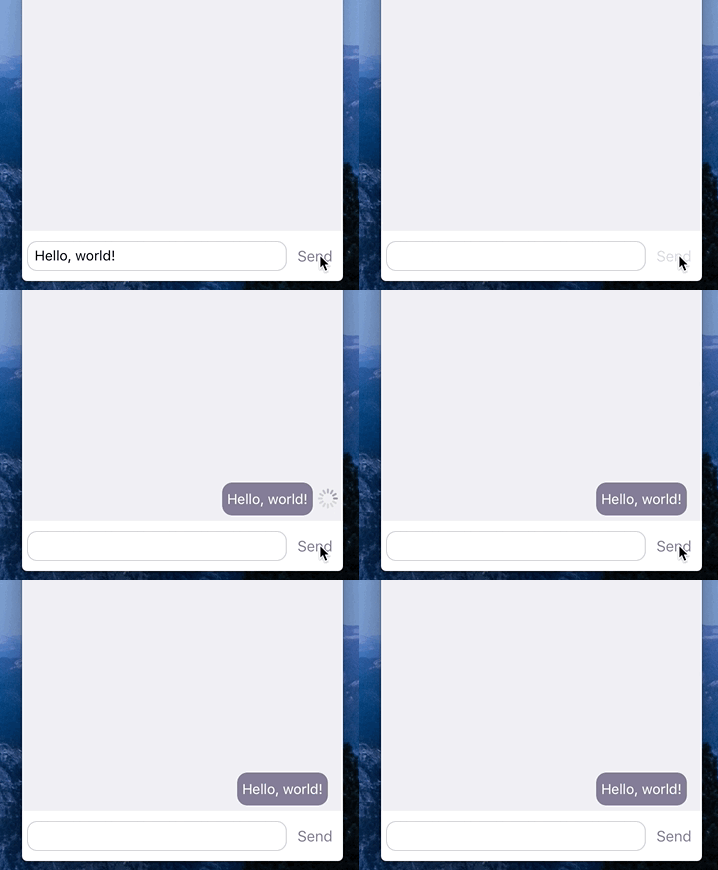
Okay, take a look at Figure 1, below. When the user sends the message, notice that the message looks like it's been sent immediately. Now, this doesn't mean the backend magically started to work faster, but it gives the illusion to the user that it did. The backend is still working at its normal speed, but the waiting time for the user has been reduced and in return is providing a better user experience.
 Figure 1: An example of Optimistic UI for a direct message (DM) app.
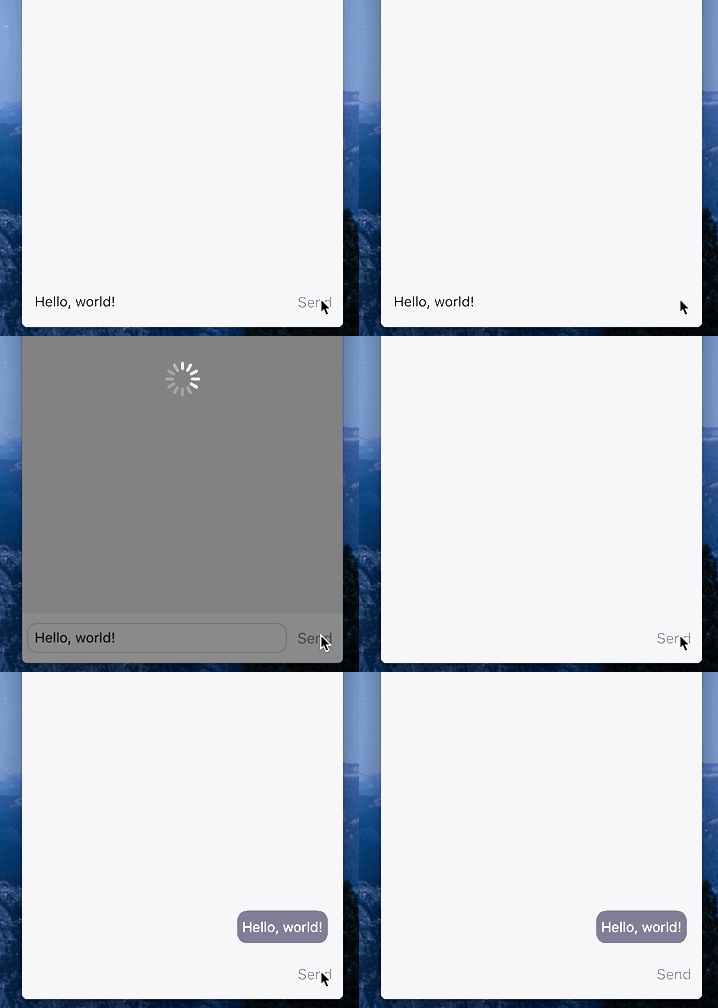
For a comparison, see Figure 2. In this example after the message is submitted, a dark loading screen appears while the backend works to send the message. Once the backend is finished, the loading screen disappears and shows the sent message inside the chatbox. This is what we want to avoid. Remember, Optimistic UI shows the final state before the app finishes its task.
 Figure 2: An example of a direct message (DM) app without Optimistic UI.
Here's a real-world example from Instagram. In their comments section, Instagram uses Optimistic UI after the user submits their comment. See the example in Figure 3. Notice the loading icon.
 Figure 3: Optimistic UI being used in the comments section on Instagram.
Task in Progress
Sometimes it's not enough to show the final state immediately. When data is submitted, usually there will be an indication that the data is still be processed. For example, a loader may appear next to the submitted data or perhaps the submitted data will have grey text while it's being processed. The text color will change to black afterward. This could be especially important if an error occurs.
Error Handling
What if something goes wrong? What if something happens in the backend and the data isn't submitted? Handling error states is a big challenge of optimistic UIs. Here are some solutions: salience and causality.
Salience
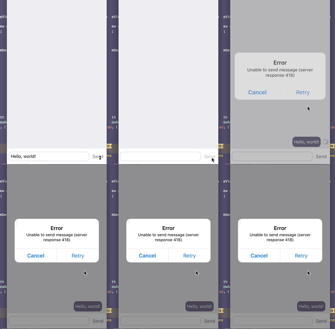
Salience means the error message/notification should be visible; the user shouldn't miss it. Here's an example of a salient error message (Figure 4). In Figure 4, the user is met with an error message that requires action in order to continue using the app. This required action notification ensures the user will see the error message and retry to submit their data. At this stage, the user is aware that there was an error and has taken steps to continue using the app.
 Figure 4: A salient error notification designed to get the user's attention.
Causality
Causality refers to the user seeing the error and being able to understand which action resulted in the said error. Here's an example of a causality error message (Figure 5). In Figure 5, notice the red color, often used in getting attention. The exclamation point (!) icon suggests attention. Combined the user notices the icon and sees their message had an error. By clicking/pressing the error icon, an option to resubmit their data may be there.
 Figure 5: A causality error notification showing the "Test" message resulted in an error.
Conclusion
Optimistic UIs can make your app more fluent, straightforward, and enjoyable to your users. They can give the illusion that your app is working faster than it actually is, meeting their need for speed.
This blog post included examples for Optimistic UI. Please refer to them if you want to add Optimistic UI to your website/app.
For error handling, please see the sections for Salience and Causality error handling. They can give you a good place to start.
Happy hacking!
Web-sovellukset

Software Engineer
Lisää luettavaa
- 9. huhtikuuta 2025
 Ilmari Haarala
Strateginen muotoilu modernin liiketoiminnan menestystekijänä
Design - 3. maaliskuuta 2025
 Ilmari Haarala
Miten Taidolle rekrytoidaan ohjelmistokehittäjiä?
Taitolaiset - 27. helmikuuta 2025
 Ilmari Haarala
Taito United mukana rakentamassa GS1 Finlandille uutta järjestelmää – "Käytettävyystestauksen kautta saatu palaute on ollut erinomaista"
KumppanitOhjelmistoprojektit